


Moodle has introduced significant changes to the user interface. The primary goals of the core updates were to improve navigation and simplify and modernise the interface.
The Moodle visual experience is quite distinct from what’s gone before. At first viewing, it seems comparatively stark but that feeling rapidly fades with exposure and one soon comes to appreciate the much cleaner modern lines.
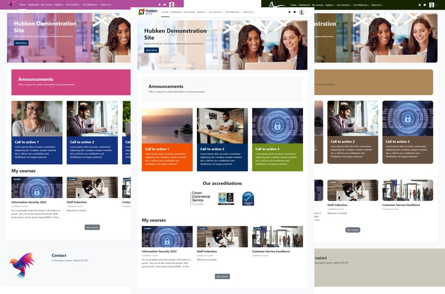
This page summarises how the Hubken Branding experience combines with the Moodle interface. We’ve picked out the main features and changes but there are other subtle improvements here and there.
In addition to the branding, there are significant changes and enhancements to the Hubken exclusive Topics Extended course format which you can read about here.
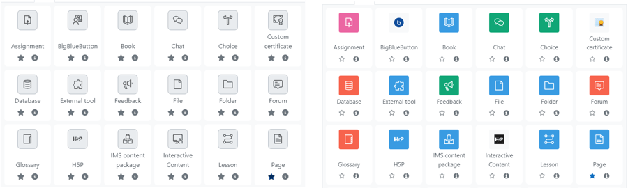
Icons
Colour scheme
Moodle has introduced new icons and has colour coded these according to the potential use case for each activity. We know that Hubken customers use Moodle activities in numerous inventive ways that may not be aligned with the Moodle developers’ anticipated use case, thus potentially introducing a confusing colour scheme.
In addition, Hubken substituted the default Moodle icon set for a more modern streamlined set many years ago.
For Moodle we’ve retained the new default icon style (it’s similar to our substituted icons) but have removed the default colour scheme. The icon colours have been harmonised to fit with any branding colour scheme.
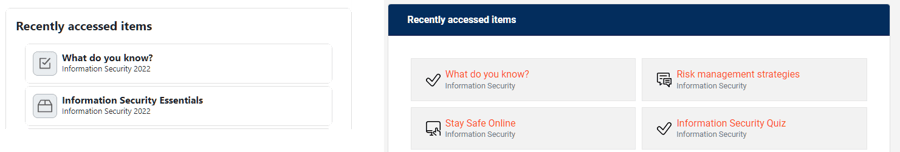
Activity completion
We’ve made it easier for learners to identify a completed activity by changing the icon colour to the “success” green when all activity completion criteria are met.
Content area width
Moodle Hubken Branding has a flexible width where the content area flexes to fit the width of most browser resolutions.
Moodle has a fixed width of 830 px. This is too narrow for most uses and is a big shift for end users moving from a flex-width experience. The maximum content width for Hubken Branding is 1,200px.
Blocks
Blocks have been simplified in Moodle and now don’t have the option of a block header.
Header layouts
We’ve simplified the header layout options to a single layout based on the Model default.
Hubken Branding configurator
Some features have been removed because they’re no longer present in Moodle, or we’ve done some streamlining and renaming to bring our branding into line with current expectations and updated Moodle terminology.
- Front Page slider > Home page Hero section
- Front Page Quicklinks > Home page CTA section (call to action)
- Front Page Text > Home page text
- Front Page Logo slider > Home page Logo cloud
Feature availability
Hubken customer administrators now have access to all the configuration features that are available to the Hubken team.
Header fonts
To improve the ability to vary the branding we’ve introduced the ability for site administrators to choose from a selection of fonts to apply to main headers throughout the site.

Home page features changes
Home page Logo cloud
The logo cloud no longer permits end users to scroll through logos if there isn’t enough space on the page. Logos that don’t fit are now stacked on an additional row.
Site administration menu
Prior to Moodle 4, Moodle introduced the Navigation Drawer – a vertical navigation feature. Hubken continued this theme with a vertical menu for site administrators.
Moodle has removed the Navigation Drawer and moved to a primary and secondary horizontal navigation approach. To keep things consistent, we’ve removed the vertical site navigation menu.
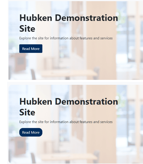
Radius feature
Boxes and buttons have 0.25rem radio radius. This can now be increased to create a more rounded appearance if that fits with your branding.
My courses page
This is a new page and we’ve enhanced the completion information to make it more visual for learners.

Course index
Moodle has introduced the Course index within courses (sort of a replacement for the Navigation Drawer). Hubken Branding supports the Course index feature.

Hubken Knowledge Base
Visit our Knowledge Base for more detail on branding configuration options.