Totara 17 has a new look at Hubken!
We’ve been working hard to bring you a further evolution of our exclusive Hubken Branding and Topics Extended course format.
Branding
We’ve polished lots of areas with small uplifts, plus you’ll notice some bolder changes too.
Our aim with this initiative is to modernise and uplift the visual experience for our clients and their end users.
We introduced a bespoke feel for all Totara sites for version 13 and the changes introduced in version 17 are an evolution of that approach that takes account of current design trends and UX research.
Current trends are for more white space and less busy interfaces. This is the experience that your end users will encounter as they navigate other modern, well-designed websites and online applications they use in the personal and work lives.
We know from feedback over the years that, even though there can be initial resistance to change (any change), the downsides to not offering an attractive user experience are reduced levels of engagement and perceptions that the organisation is out of date.
In this refresh you’ll notice a new font and slightly increased font size to improve readability. This addresses repeated feedback from customers that it was a little too small previously.
As you’ll see in the screenshots below, where we’ve been able to, we’ve made the overall presentation less angular by introducing a radius on some corners.
Prior to version 17, setting a course colour value in the course settings affected various interface elements (including course progress indicators). The UX expert advice we received whilst scoping the development work was that, although it was a great idea three years ago, that approach doesn’t fit with today’s thinking on good practice around enabling users to focus on content by removing superfluous interface elements. A colour can still be set, but this will now only be visible in the course header if a header image hasn’t been added.
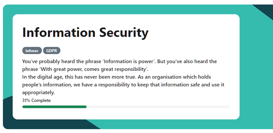
One other significant change is that the colour of all progress indicators has been harmonised (you’ll see this in the screenshots below). This is a deliberate decision to provide a uniform, consistent experience for learners that is WCAG AA compliant.
New banner styles
We’ve added three new banner styles you can add using the Featured Links block. These are banner-4, banner-5, and banner-6, which can easily be swapped to replace the existing banner-1, banner-2 or banner-3 styles.
These styles work with full-width Gallery and Static tiles.


We’ve also spruced up the smaller tiles with rounded corners.
Blocks
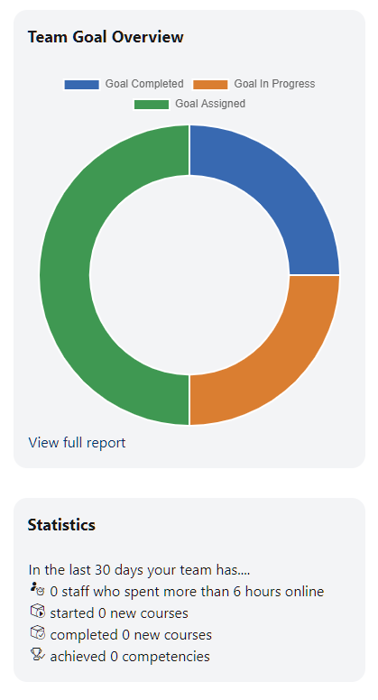
Blocks now have a subtle grey background.

Fonts
You can now select from a range of modern heading fonts to help with aligning the platform to your own branding. Here are some examples from a programme header:


Plus, we’ve updated the primary font and font size to help with usability.
Login page
We've streamlined the login panel on the login page. Plus, it’s now easier to change your login page image.

Catalogue cards
Lots of polishing has been done to remove unnecessary white space, create modernised progress bars, insert improved hero image icons and provide Featured Course positioning.

Course, programme, and certification icons
We’ve replaced the default set of icons with more modern, neutral icons.

Navigation bar
The navigation bar has been reworked, making it more subtle and modern in style.

Programme and Certification page improvements
There’s a brand-new header with consolidated information about the programme or certification. We’ve also harmonised the progress bars and improved the spacing for your custom icons in course sets.

Topics Extended course format
Our popular Hubken exclusive course format is the default for all new courses from Totara 17.
Grid layout
By popular request, we’ve built a grid layout.

Activities will normally display in a tile on the course page, but if you want an activity, e.g. a Seminar, to display on the course page the Grid format works nicely with that too.
This layout works best in a two-column format i.e. blocks on just one side of the page.
List layouts
Existing Topics Extended users will know that learners can only view one open section at a time. We’ve added an additional List layout that enables learners to have multiple sections open.

New course blocks
Totara adds quite a few blocks to the course page when you create a new course. You’ve told us that you often delete many of these because they don’t fit your course design requirements.
From Totara 17, new courses will only add the Administration and Navigation blocks to keep things clutter-free. You can still add the additional blocks you really need.
Progress indicators
Activities
We’ve taken the most recent research into account in this redesign of activity completion indicators. It’s easier than ever for learners to identify what’s complete and what’s still to be done. When an activity has been completed, its icon turns green.

Sections
Section completion status radials have been given a facelift.

Course progress bar
The course progress bar is now streamlined and located in the course header.

Section and activity duration
You’ve always been able to indicate a duration for completing a section. We’ve extended that feature to individual activities - a great feature for helping learners manage their time.

Restricted activities
Activities with restricted access now have a clear indicator that they’re not available yet. We've also added a slick pop-up that displays the access criteria.

Seminar
There’s a new "Booked" indicator so learners can see what they’ve signed up for more easily. The signup and view all events links are now buttons. The “View event” call to action is now the more immediate “Sign up”.

Course header
We’ve given the course header some love and tidied up some of the other course elements.
If you’re using course tags and/or the course summary, you can now display them in the header. We’ve made the size and position of the header image more modern and incorporated the progress bar into the overlay.
If you want to keep things simple, turn off the options you don’t want as far as just keeping a text-only header.


