UX modifications you can expect with Hubken

We believe it's important that your LMS looks and feels like it belongs to your organisation from the get go. So, we've made some modifications to the 'standard' login pages for both Totara and Moodle, delivering enhanced visuals, cleaner and clearer interactive modules, and deeper customisation options.
Our UX enhanced login page provides full page image customisation and a stylised, fully branded login box. With all these elements at your disposal, your users will feel at home before they've even logged in.
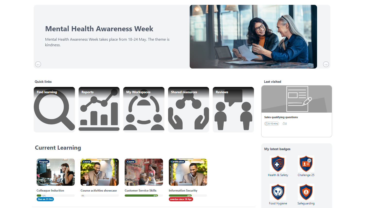
Our enhanced Totara dashboard provides a bolder, more contemporary UI making it easier to share information and updates with learners.
We've included a range of custom banners with embedded design options, meaning our clients can tailor dashboard banners to suit organisational messaging and learning priorities.
Our 'Current Learning' module displays quick view summaries of module activity, with progress bars and completion percentages alongside alerts such as approaching or missed due dates.
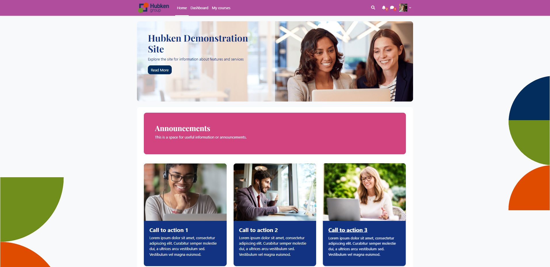
Moodle's 'out of the box' homepage offers little in the way of visual engagement or advanced functionality. Therefore, we committed to making this page much more user friendly with a brighter, sharper, and more appealing UI.
Some of our exclusive enhancements include:
- A 'hero' banner at the top of the page, with sliding functionality and customisable elements (imagery, colour, text, and clickable links).
- We've added an 'Announcements' module for highlighting key messages or prompts. This module can also be split into multiple columns.
- Multi-functional 'call to action' buttons with accompanying space for custom images. These buttons can be used to link to a specific page, or can be designated as content only boxes.
- A 'logo cloud' area for sharing organisational accreditations or brands.
- An enhanced 'Available courses' area, with expanded imagery areas and improved animations.
.jpg)
When it comes to viewing and accessing courses on Totara, we've invested a lot of time getting the UX just right.
A top banner display can be customised with an image, course summary, overall course completion, and even course tags to enable easy topic module searching.
We've also overhauled the individual activities layout with aesthetic and functional improvements:
- Completed activities and logos turn green whereas uncompleted activities remain greyed out for clarity and concision.
- Estimated 'time to complete' displays can be added to each activity so learners can plan their learning accordingly.
- We also updated restrictions notifications so that any restricted activity features a prominent 'Restricted' logo with pop-up box for context.
- Activities can also be set to horizontal or vertical grid displays depending on preference.
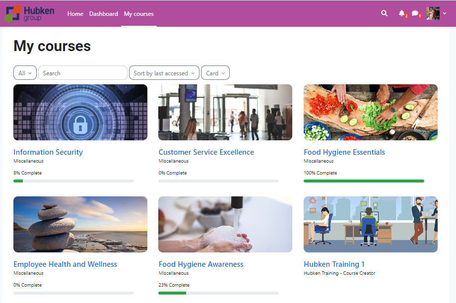
In optimising the Moodle course page, we took the existing display and made changes with navigation and ease-of-use in mind.
Firstly, we enlarged the grid presentation of courses and the accompanying image area for a more immediate and contemporary layout.
Secondly, we built course progress bars and percentage indicators into the display, meaning learners can quickly assess their progress across all modules in one place.
.jpg)
Modernising the Moodle course view involved replacing the 'out of the box' activity icons, which were previously colour coded, with uniformly coloured and more subject appropriate icons.
By bringing all icons into a single colour scope, we were able to apply a green icon overlay for completed activities, making the distinction between complete and incomplete modules much clearer.
We also introduced a top banner section for course details and imagery, as well as an automatically updating progress bar with percentage indicator.

Yellow Room Learning
Want to find out more?
Get in touch with us today to discuss your requirements with one of our experts.